Project Overview
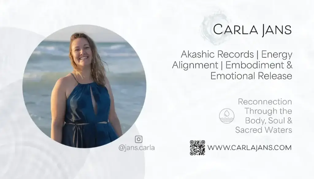
I designed a business cards for my client, Carla Jans, an energy practitioner and Akashic Records Reader. Her practice centers around the element of water and emotional healing. The flow of water and ripple effect immediately inspired me.
She was working on a redesign of her brand with new colors and feel. The original felt generic and disconnected form her brand identity. She wanted her cards to have a calming effect in the body.
Process and My Role
We began with an in-depth discovery session to get clear on what she was looking for, what her mission was, visual preference and the feelings she wanted clients to experience when receiving her cards.
After providing her with three different layouts of the card, we refined the concept that best represented her brand, creating a circle of life vibration with a calming color palette.
I used Adobe Illustrator for this project.
Challenge and Solution
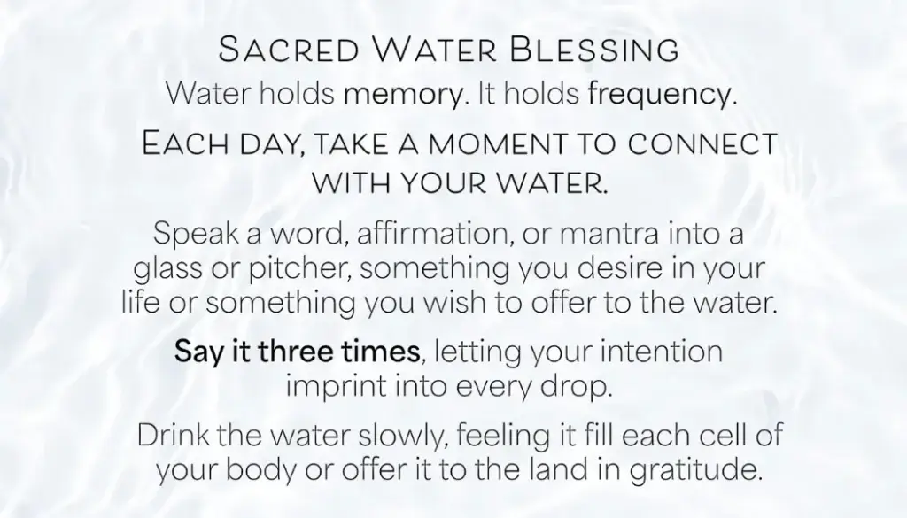
The challenge was to get all the information on the card and not have it lose that calming feeling.
The combination of softer fonts, varying font weights added a nice lightness to the cards.
Results and Learnings
The client was thrilled with the final design ‘felt like’ her and aligned with her purpose and energy. I learned that really listening to the client allowed me to feel into the design and not overthink it.
Front
Back